
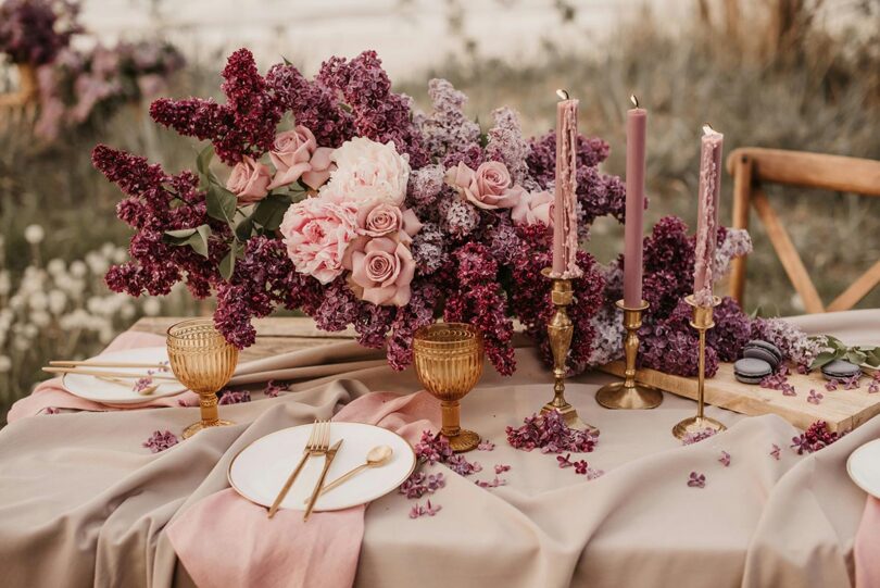
Every planner has seen it. The bride picks a sage that looked perfect on the mood board, five dresses arrive in the same shade, and at the first look three bridesmaids glow while two look faintly unwell. Nobody did anything wrong. Sage is a lovely color. It is also a muted, grayed, mid-depth color, and two of those five women were built for clear, saturated ones.
The fix is not a better sage. It is a better question. Instead of “which color?”, ask “which family of colors?” Personal color analysis has a vocabulary for this, the twelve color seasons, and this guide uses it for bridesmaids, groomsmen, the mother of the bride, and the light in the photographs.
Why one shade cannot flatter five people
Color analysts sort people on three questions, and all three show up in a group photo. Undertone is the cast beneath the skin: golden reads warm, pink reads cool. Depth is how light or dark the overall coloring sits, hair included. Clarity is whether the features look crisp and high-contrast or blended and soft. One dress color answers all three at once, so it can be right for one woman and wrong for the next.
The camera makes it worse. The Colour Literacy Project, an education initiative of the Inter-Society Color Council and the International Colour Association, defines simultaneous contrast as a color’s tendency to push its neighbor toward the opposite hue, lightness and chroma. A warm, golden face beside an icy mint dress drives both apart: the mint reads bluer, the skin redder. Beside a warm olive, the push is small. The dress is the largest color next to every face in the frame, so the dress does the pushing.




Pick a family, not a color
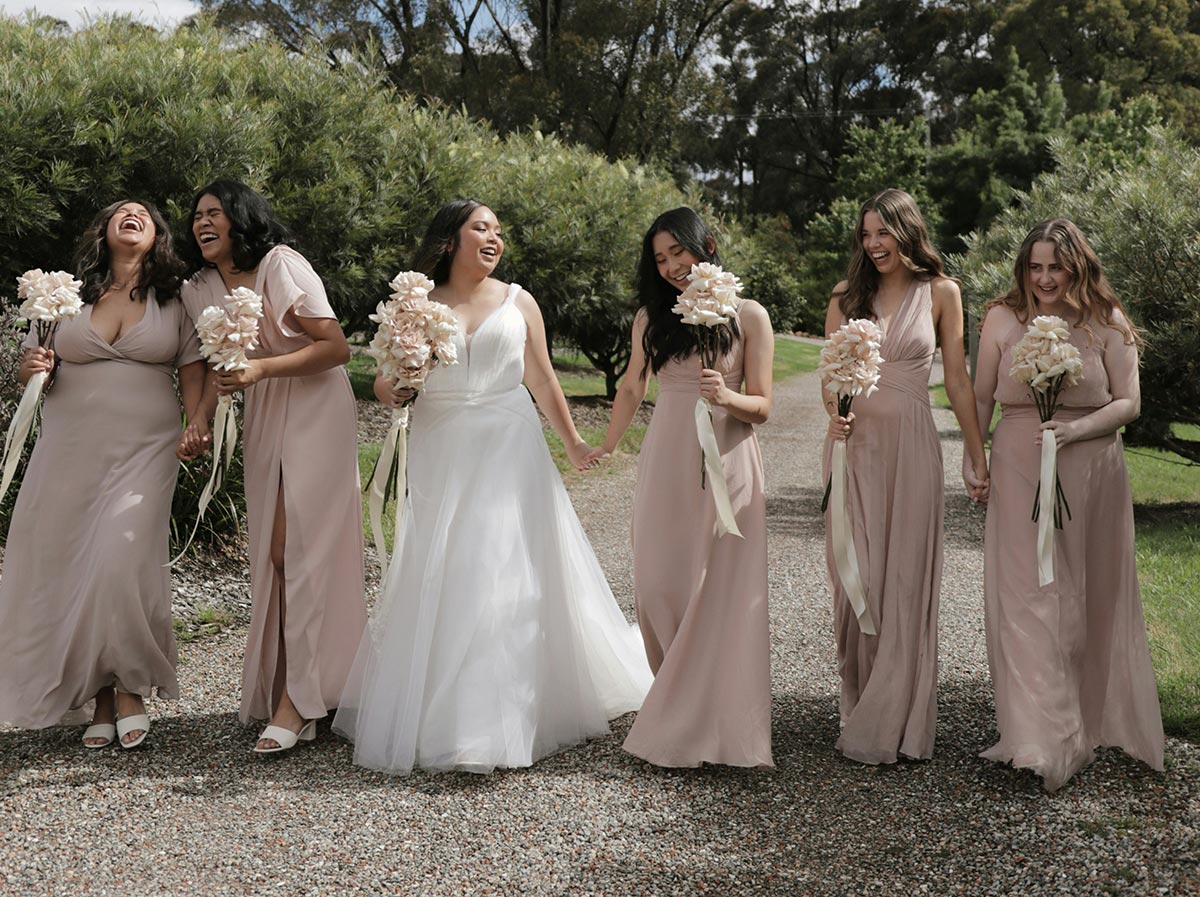
The mismatched-dress trend is the right instinct with the wrong rulebook. Zola’s guide to mismatched bridesmaid dresses notes that “what looks mauve to one person may be more pale violet to another,” and suggests choosing “a color family, like warm tones or cool tones,” rather than a single shade. The family is the rule; each bridesmaid’s shade is her answer to it. The rule comes in three decisions.
- Warm or cool. Count undertones across the party; most groups tilt one way. Four of six warm, go warm: peach, terracotta, olive, camel. Tilting cool: rose, mauve, slate blue, plum.
- Light or deep. Set the depth band around the majority. Blondes photograph best in the lighter half of a family; dark hair and deep skin carry the darker half. A spread of depths is fine as long as everyone stays inside one undertone.
- Soft or clear. Decide whether the family is muted (dusty, smoky) or clear (clean, saturated). Couples skip this one and photographers notice. Dusty rose and hot pink are both pink; they will never look like one party.
Fix two of the three and let the third move. Warm and muted at any depth gives apricot, rust, olive and camel. Cool and clear gives cornflower, fuchsia, emerald and true navy. Those same three decisions separate the twelve seasons from one another; to see them side by side, Colorito’s free guide, the 12 color seasons explained, walks through all twelve palettes with each one’s best and worst shades.
The bridesmaid whose coloring falls outside the family gets the bridge shade, the color inside the family nearest her side: in a cool rose party, the one Warm Autumn takes the rose that leans peach rather than violet; in a warm terracotta party, the lone Cool Summer takes the dustiest apricot rather than the burnt orange. Nobody breaks the rule, and nobody gets washed out.
The men, and the mother of the bride
Groomsmen are easier, because the suit is a neutral and the tie is where the season shows. Charcoal and true navy are cool neutrals for rose, plum and slate parties; tan, brown and olive are warm neutrals for terracotta, sage and camel; mid-gray works with either. Match the tie to the bridesmaids’ family, one notch deeper: dusty rose dresses, a muted plum tie; sage dresses, a deep olive tie. Keep the groom one step deeper so he reads as the groom, not the sixth groomsman.
Mothers of the bride and groom should not be asked to wear the bridesmaids’ color. Give her the family and the depth band and let her choose inside it. A mother with cool, deep coloring beside a light, cool party looks wonderful in navy or deep plum; in the bridesmaids’ pale blue she looks like a chaperone. Photographs want harmony, not a uniform.
Venue light and the camera
A wedding day moves through more kinds of light than almost any other event. Cambridge in Colour’s white balance tutorial lists the color temperatures photographers work with: electronic flash at 5000 to 5500 K, clear-sky daylight at 5000 to 6500 K, moderate overcast at 6500 to 8000 K, shade or heavy overcast at 9000 to 10000 K, and candlelight at 1000 to 2000 K. Lower is warmer and more orange; higher is bluer.
So a ceremony in open shade pushes every color cool: a cool palette turns icy and a warm one goes a little gray. A candlelit reception pushes everything warm, so dusty rose turns peachy and sage turns khaki.
Three habits protect the palette. Take the fabric swatch to the venue at the ceremony hour and look at it in the actual light. Ask the photographer whether the reception will be shot with flash or ambient light; flash resets colors to daylight and can make a candlelit palette look colder than the room felt. When torn between two versions of a shade, choose the muted one. Muted colors absorb a lighting shift; clear ones announce it.
Season to shade: a short cheat sheet
| Season | Bridesmaid shades that photograph well |
|---|---|
| Light Spring | Peach, buttercream |
| Warm Spring (True Spring) | Coral, warm turquoise |
| Bright Spring | Clear coral, bright aqua |
| Light Summer | Powder blue, pale rose |
| Cool Summer (True Summer) | Dusty rose, periwinkle |
| Soft Summer | Mauve, smoky teal |
| Soft Autumn | Sage, warm taupe |
| Warm Autumn (True Autumn) | Terracotta, olive |
| Deep Autumn | Rust, forest green |
| Deep Winter | Burgundy, pine green |
| Cool Winter (True Winter) | Cobalt, true red |
| Bright Winter | Fuchsia, emerald |
One row suits a party that shares a season; a mixed party reads down a family, since each block of three shares an undertone.
Three questions people ask next
Do all the bridesmaids need a color analysis first? No. Sort the party by undertone in daylight: does gold or silver jewelry sit better against her skin? That settles the family for most groups. If two people are hard to call, a photo-based analysis settles it in about a minute; Colorito’s costs $9, works from one photo or an Instagram profile, and returns her season, a ten-color palette with hex values, the colors working against her, and the evidence behind the verdict.
Our colors are set, and they are wrong for half the party. Now what? Keep the hue and move the other two dials. If the color is a clear, cool pink and half the party is warm and soft, ask for the dustier, warmer pinks in the same fabric line. Let the difficult shade live in the bouquets and ribbons instead of against the faces, because the color nearest the face carries the photo.
Is there a shade that flatters almost everyone? The ones near the middle of the map: soft teal, dusty blue, muted plum, and a navy that leans slightly warm. Neither strongly warm nor cool, neither loud nor pale, they trouble the fewest faces.
Back to the sage. The two bridesmaids it washed out were bright and clear; a cleaner, brighter green, closer to a fresh olive, would have kept them inside the palette and inside the glow. Choose the family first, let each woman answer it in her own shade, and the photographs will show one party made of individuals.